INQ Cloud Range
INQ Mobile, London
2010-2011
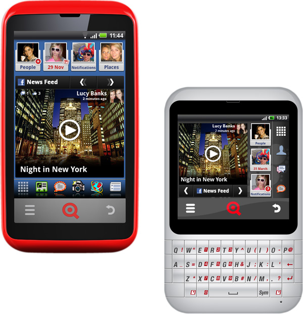
INQ Mobile gained market success and industry acclaim with their first device the INQ 1, which won Best Mobile Handset in the 2009 GSMA awards. This established them as an exciting new kind of mobile device company. A small startup designing and selling products for a particular audience; young people with a tight budget but a desire to make the most of their favourite social networking and media services on their phones. Building on this success, INQ’s next venture was a range of Android handsets with a number of UI customisations and service partnerships, including Spotify and Facebook.
For the INQ Cloud range I worked on broader user experience, identifying potential business developments through competitor analysis, UX design strategy and concepting for new software and service projects. I also led the delivery of UI projects, working closely with INQ’s software engineering team to provide detailed designs for implementation.
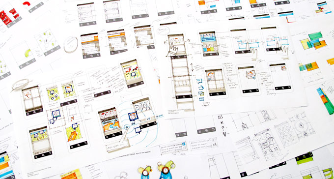
It was great to take advantage of INQ’s small scale to share early design concepts across the company in the first days and weeks of a project. Rapid rounds of sketching accelerated discussions of how business requirements and user needs could manifest themselves in design solutions. It was also a fantastic way to discuss technical opportunities and challenges with engineers while initial concepts were taking shape.
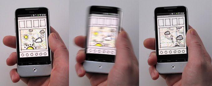
Functioning sketch prototype made in Android App Inventor to explore gestural interactions.
My major focus for the Cloud Touch range was the design of the home-screen experience. Taking advantage of exclusive Facebook partner APIs, we built a series of widgets and accompanying apps. Individually, or in combination they made it easier to get updates from you’re closest Facebook friends, and see your latest News Feed updates in a much more visual format than the standard mobile app experience.
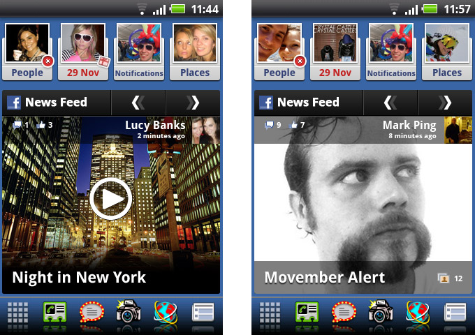
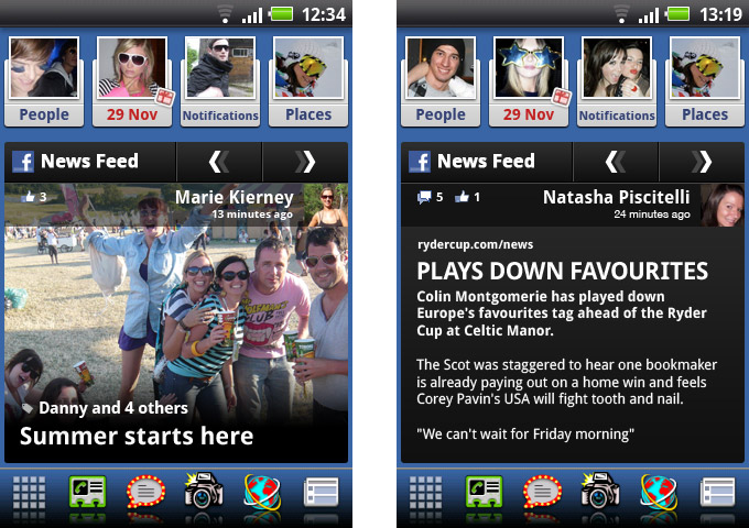
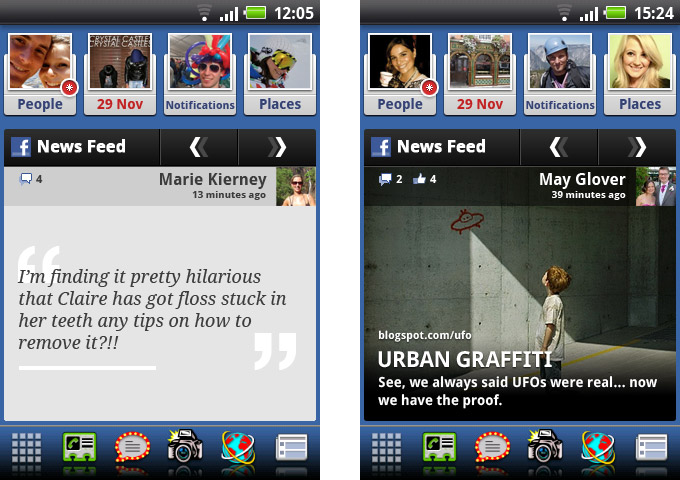
Cloud Touch devices were generally sold with more modest data plans. Moderating the amount of data used by the home-screen UI, particularly in automatic syncing, was crucial. We had to strike the right balance between a more visual display of updates with the always-on ‘live’ nature of the home-screen. Sourcing and reformatting data from Facebook as well as linked sources made this an interesting challenge. I worked closely with INQ’s engineering team to design this experience holistically, both the UI and the data model serving it. I also got the chance to assist the visual design team in the delivery of layouts and visual assets.
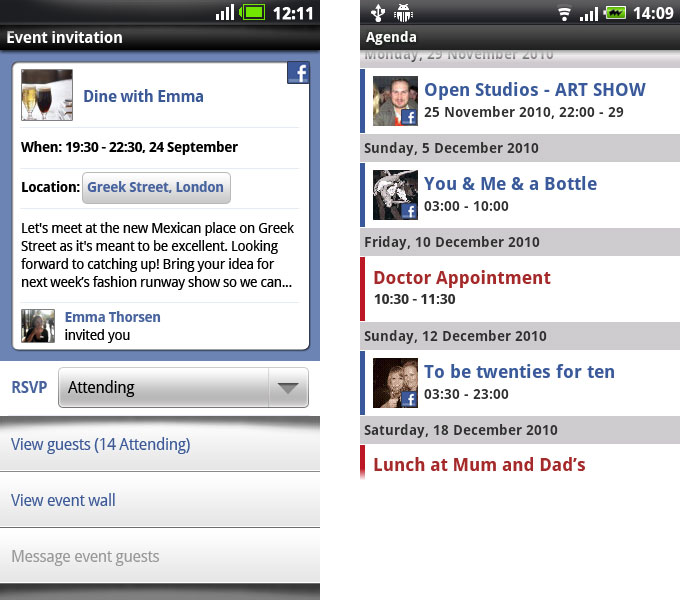
In addition to delivering INQ’s home-screen I worked on the integration of Facebook events and birthdays into a custom version of the Android Calendar app.

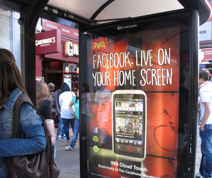
My work was central to the marketing campaign for the INQ Cloud Touch.